supergreat
Supergreat is the beauty app for all. Give us your barefaced, your curly-haired, and your ‘I’m not sure where to start'-ers. We'll give you livestreams from your favorite makeup artists, beauty challenges, and the latest product drops from indies to big-name brands alike.
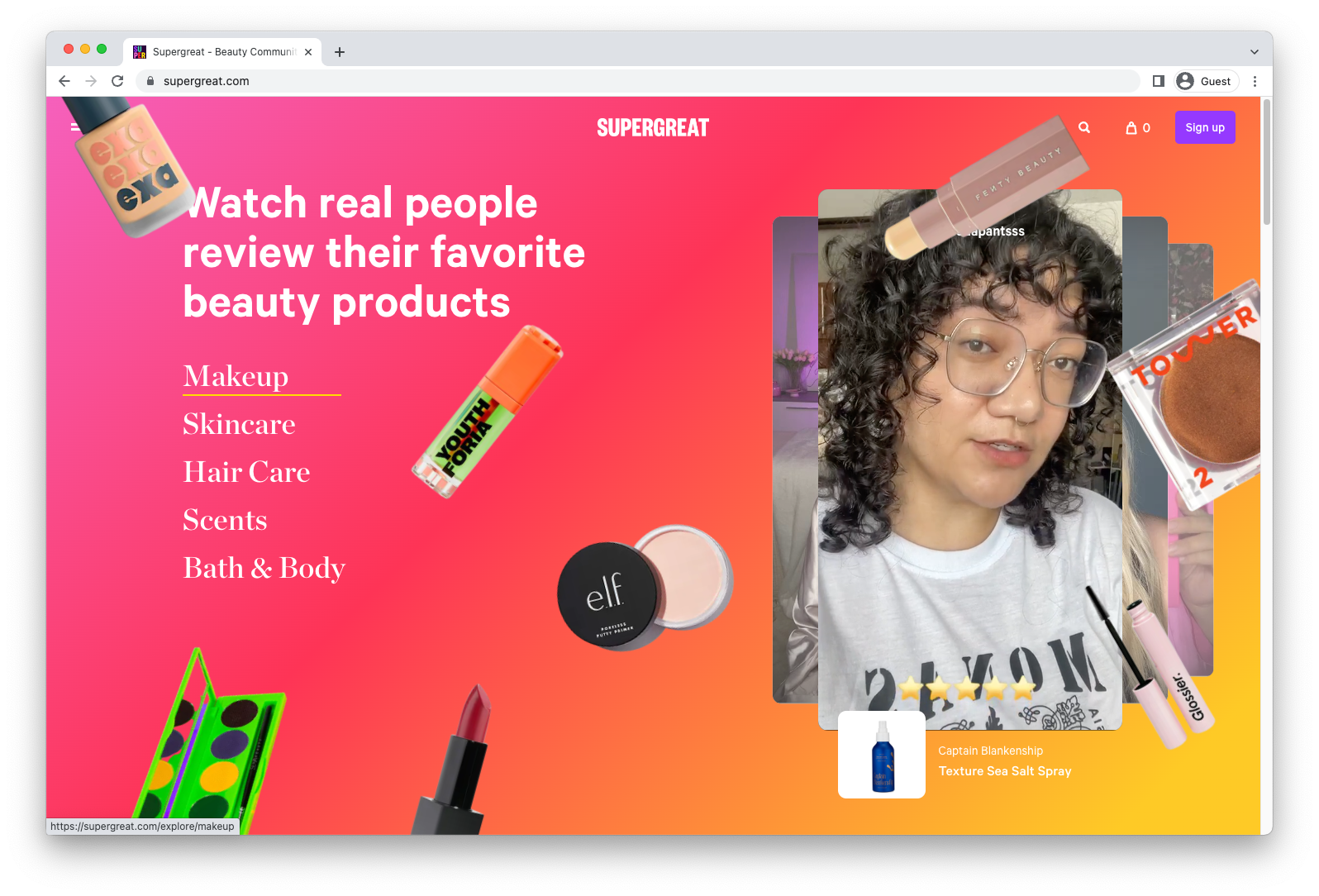
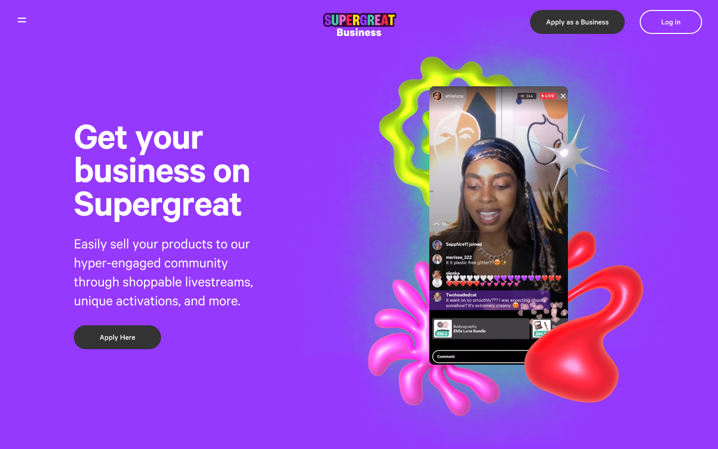
As Design Director, my overall role was twofold: 1) Revitalize the brand’s presence to address its core demographic of women ages 13-25, and 2) Partner with the Product and Marketing teams across roadmaps and campaigns, including launching fully redesigned desktop web experiences and launching Supergreat’s first-ever business portal.
When rethinking the brand, I explored visual styles that would pique curiosity, encourage expression, and most importantly exude beauty: A world of vibrant color, texture, and depth.
This was achieved by harmonizing the use of logo, palette, and typography across surfaces. The introduction of thoughtful color blends, bold new collage and illustration styles, expressive typography, and clear guides around logo use evolved the brand’s presence, while staying true to Supergreat’s Gen Z community.
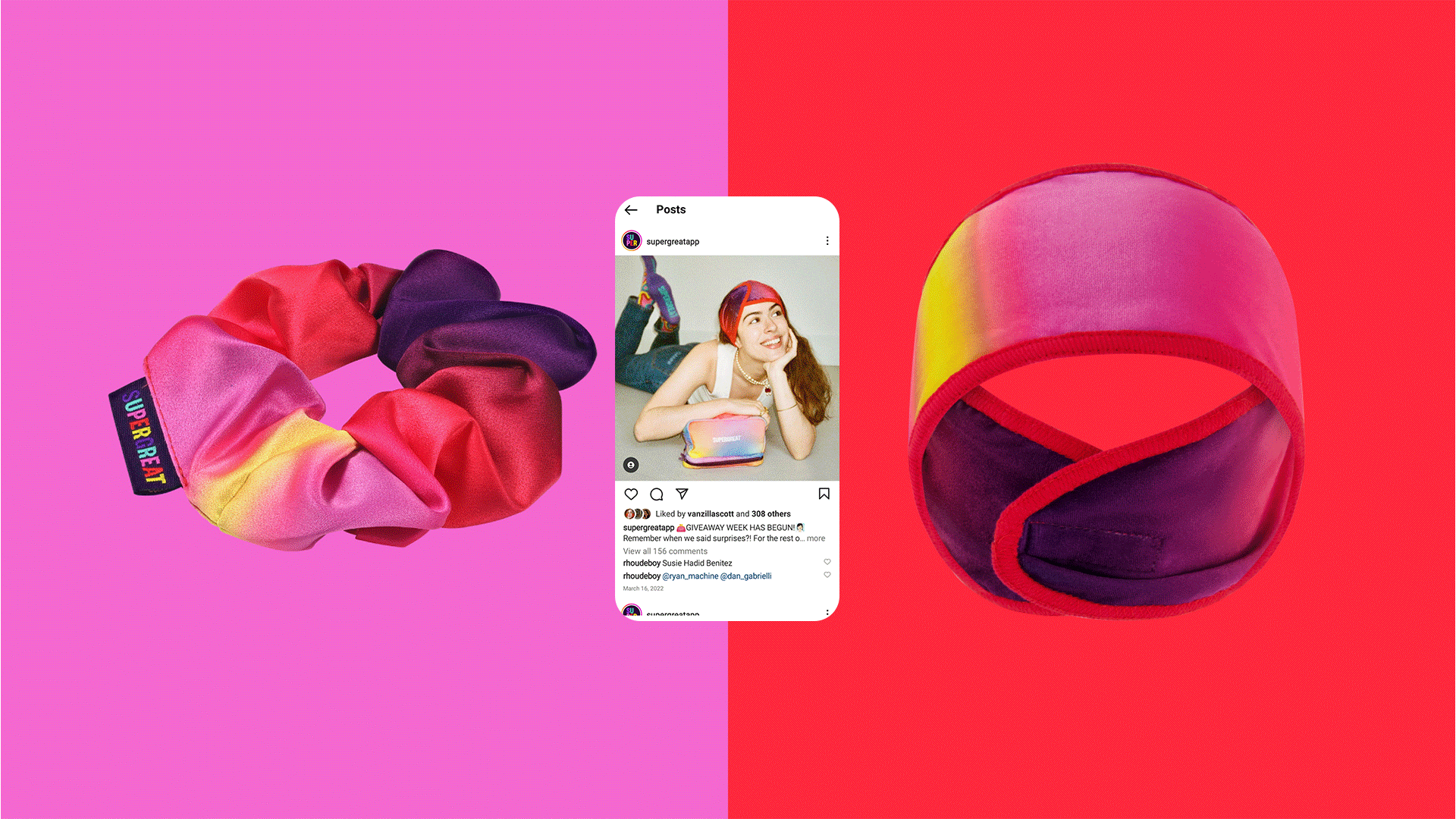
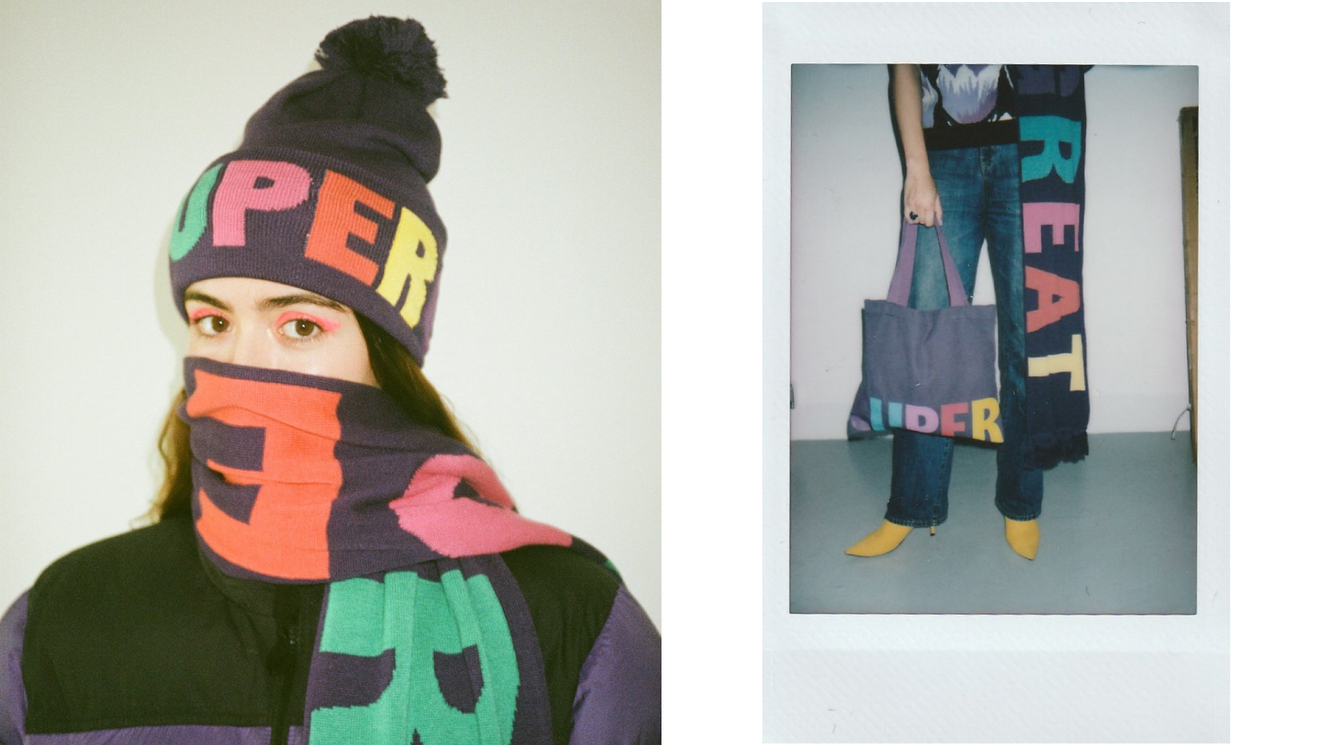
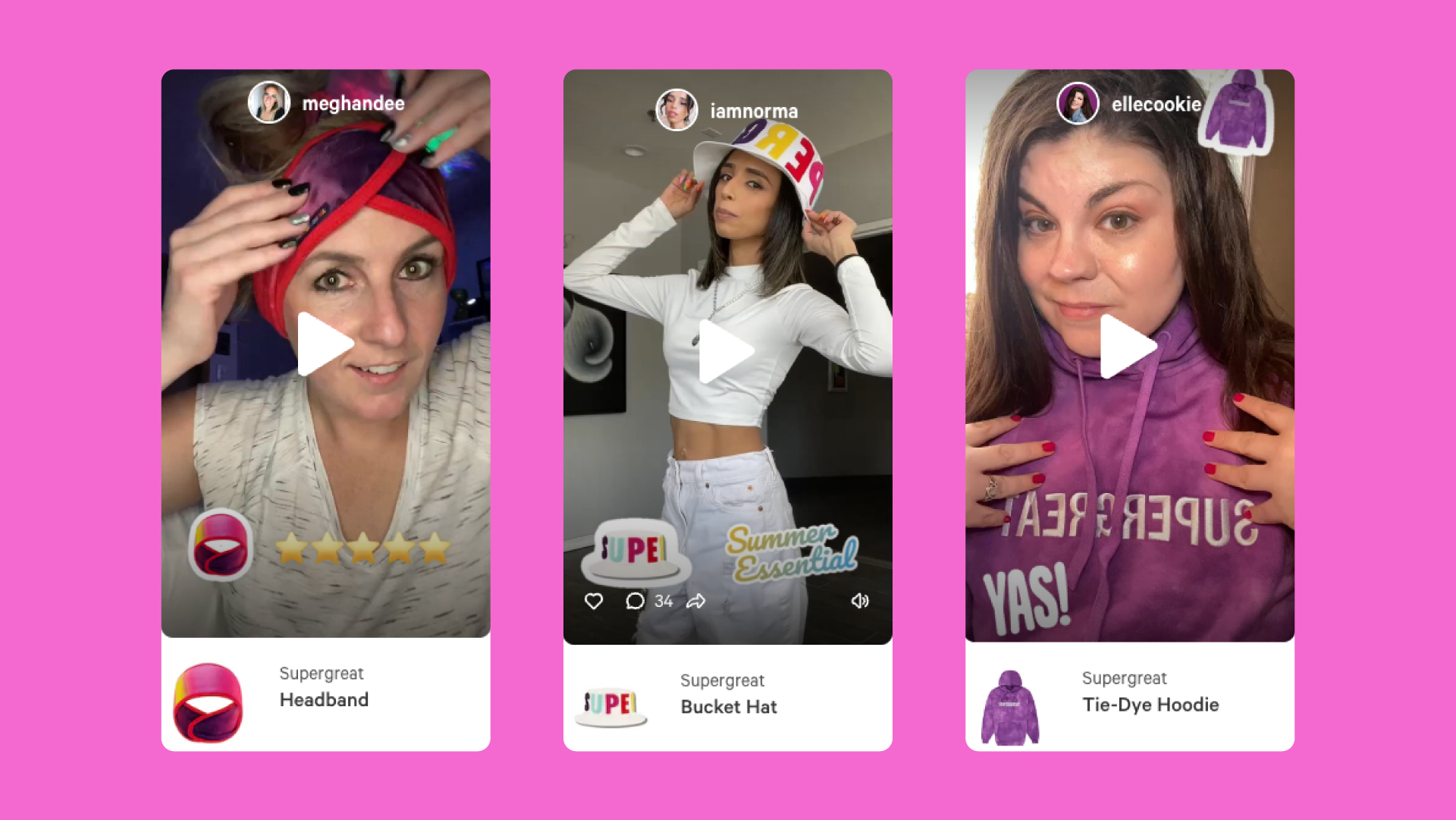
In regular partnership with Marketing, my team created content to engage the community across the app and social channels, such as artwork for special livestreams, sales, and drops. The brand team also produced activations like Halloween, holiday, back-to-school, and Supergreat’s beauty awards for the app and dot com to support growth and shopping goals. Beyond the digital space, we also created seasonal merch, packaging and inserts for beauty shipments.
Role: Design Direction / Design
Design + Illustration: Yracema Rivas, Hannah Minn, Paulina Almira
Product Design: Sunny Li, Janie Seo, Andrew Feidler
Photography: Savannah Scott
Typography: Calibre by Klim Type Foundry
01. the brand


In 2021, the initial goal was thoughtful color infusion across surfaces to establish a sense of brand and connection from logo mark to content. Secondaries were introduced in 2022.

The new color combinations tapped into the primary tones and took a graphic approach to gradients in order to add texture, dimension, and contrast.
02. application across surfaces: dot com, app, social, business portal, presentation design


03. beyond digital